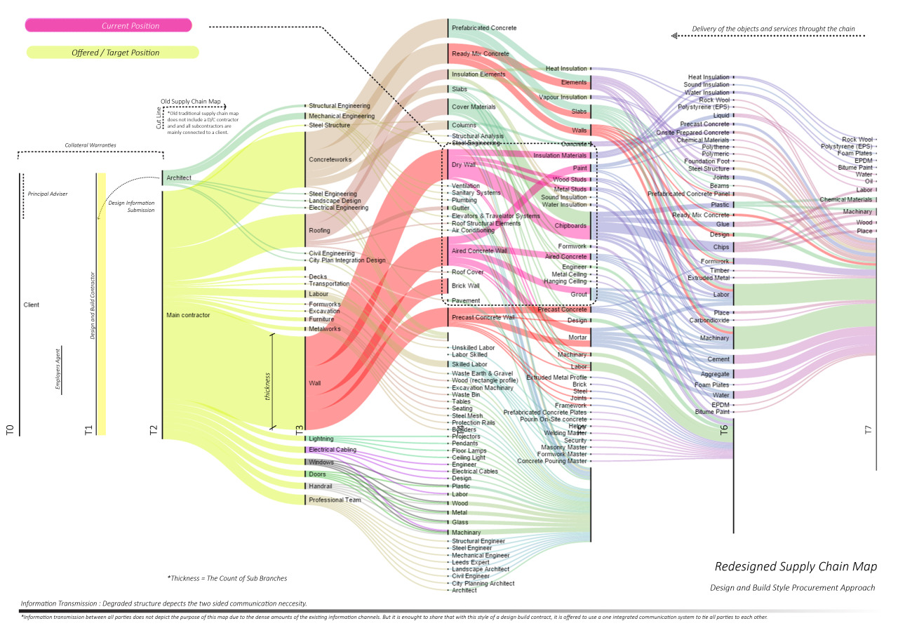
Alluvial Diagram + hybrid Modifications / “Sankey Diagram”
During my supply chain management classes, I created a fictional supply chain system for a hypothetical company called “Max Profit Industries” to highlight its complexity and summarize key information for easier focus. Similar to most modern infographics, this map is detailed yet presents a simplified visualization. Thickness indicates the importance of certain branches, while colors designate the roles and tasks of subcontractors. Columns represent the subcontractor tiers, and various symbols are used to depict information flow and item delivery.
PS: The lecturer referred to the map as a Sankey Diagram, but since I was uncertain about its exact definition, I opted to call it an Alluvial Diagram, as it was labeled in the application I used. However, after making some modifications and enhancements, the map evolved into a hybrid form.
Leave a Reply